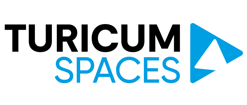
The New TURICUM SPACES Logo
TURICUM SPACES has renewed – we are introducing a new logo and visual identity.
This change symbolizes our direction – moving forward together with the community we build every day.
Why are we doing this?
We want our visual identity to reflect even more clearly what defines us: modernity, international character, and a high-quality community. Our previous logo accompanied us from the very first steps, but as our services and community continue to grow, it was time for a symbol that better represents the current vision of TURICUM SPACES.
The new logo is a symbol of our direction:
- TURICUM – inspired by Zürich, representing internationality and quality.
- SPACES – modern spaces and services designed for seamless work and collaboration.
- The symbol – constant movement, growth, and development, representing the space where ideas are born.
This is more than a visual change – it is a statement that we continue to strengthen what matters most: being a reliable partner in your business journey to success.
This step is a natural part of TURICUM SPACES’ evolution, reflecting who we are today and where we are heading.
Leave a Reply